A bold, human identity for a new hiring experience
Benchler is a hiring platform designed to make the first connection between tech specialists and companies more relevant, transparent, and human.
Clearl developed a complete visual identity that gives the new product a recognizable personality while keeping it credible enough for the hiring market.
Challenge
Early hiring interactions are often stressful and impersonal. Strong specialists can be overlooked during short introductory calls, while companies struggle to understand the person behind a traditional CV.
Benchler needed a brand that could challenge this conventional experience without looking like another corporate recruitment platform.
The identity had to feel:
Human and approachable
Bold but trustworthy
Relevant to the tech community
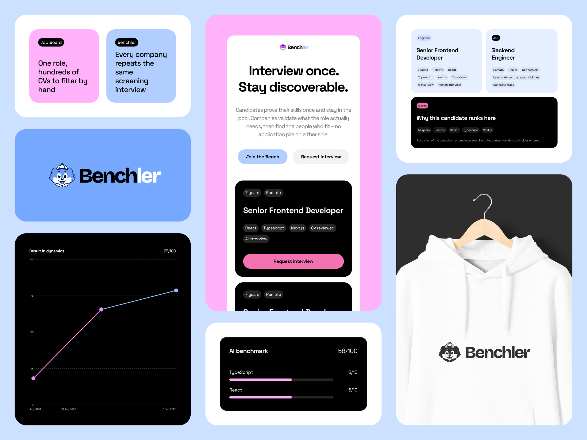
Flexible across product and marketing
Distinctive enough to support a new market entrant
Brand Direction
We positioned Benchler as a confident and supportive character within the hiring process — not another formal intermediary, but a platform that helps people and companies understand each other sooner.
The visual direction combines the clarity of a digital product with the energy and personality of an independent consumer brand.
Logo and Character
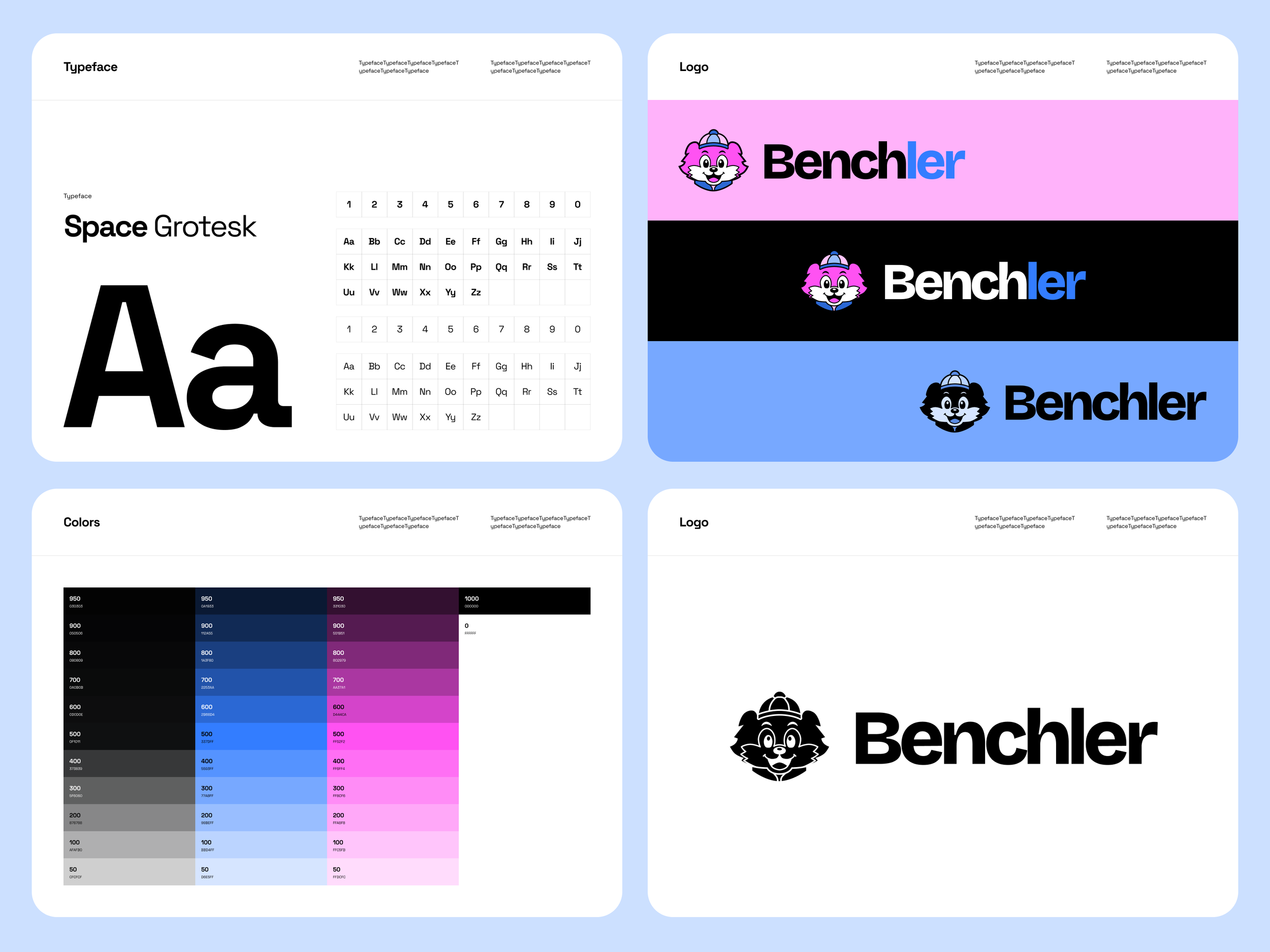
Instead of relying on a generic technology symbol, we created a recognizable character as the core of the identity.
The Benchler character represents a friendly guide through the hiring process. Its expressive appearance makes the brand easier to remember and gives the product a human presence across different touchpoints.
Strong black outlines and simplified shapes keep the character clear and recognizable at different sizes.
Color System
The identity is built around a high-contrast palette of electric blue, vivid pink, black, and white, supported by additional colorful accents.
The bright colors make Benchler feel energetic and progressive, while the black-and-white foundation keeps the system structured and credible.
The palette can be used in different combinations, giving the brand enough flexibility for product interfaces, social content, campaigns, and illustrations.
Visual Language
We developed a flexible visual system based on:
Bold color combinations
Character-led illustrations
Strong black borders
Clean typography
Simple graphic compositions
Modular layouts for digital communication
These elements allow Benchler to remain consistent without making every application look identical.
Digital Applications
The identity was designed to work across the full product ecosystem, including:
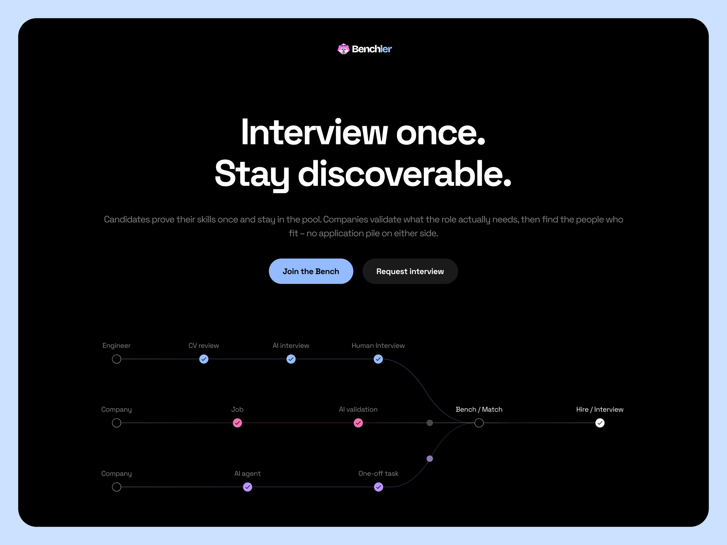
Website and landing pages
Product interfaces
Candidate and company profiles
Social media content
Marketing campaigns
Presentations and branded materials
The character can act as a recognizable visual anchor while adapting to different messages, audiences, and product scenarios.
Outcome
The result is a bold and scalable identity that helps Benchler stand apart from conventional recruitment platforms.
The new brand feels human enough to connect with tech specialists, structured enough to build trust with companies, and flexible enough to grow alongside the product.
Benchler now has a clear visual foundation for building recognition across both its product and communication channels.
