Designing a dating experience that starts with conversation, not appearance
Industry
Dating · Social Networking
Platform
iOS · Android
Services
Product Strategy · UX/UI Design · Interaction Design · Design System
Overview
Most dating apps encourage people to make instant decisions based primarily on photos. This product explored a different approach: helping users connect through preferences, personality, and conversation before appearance.
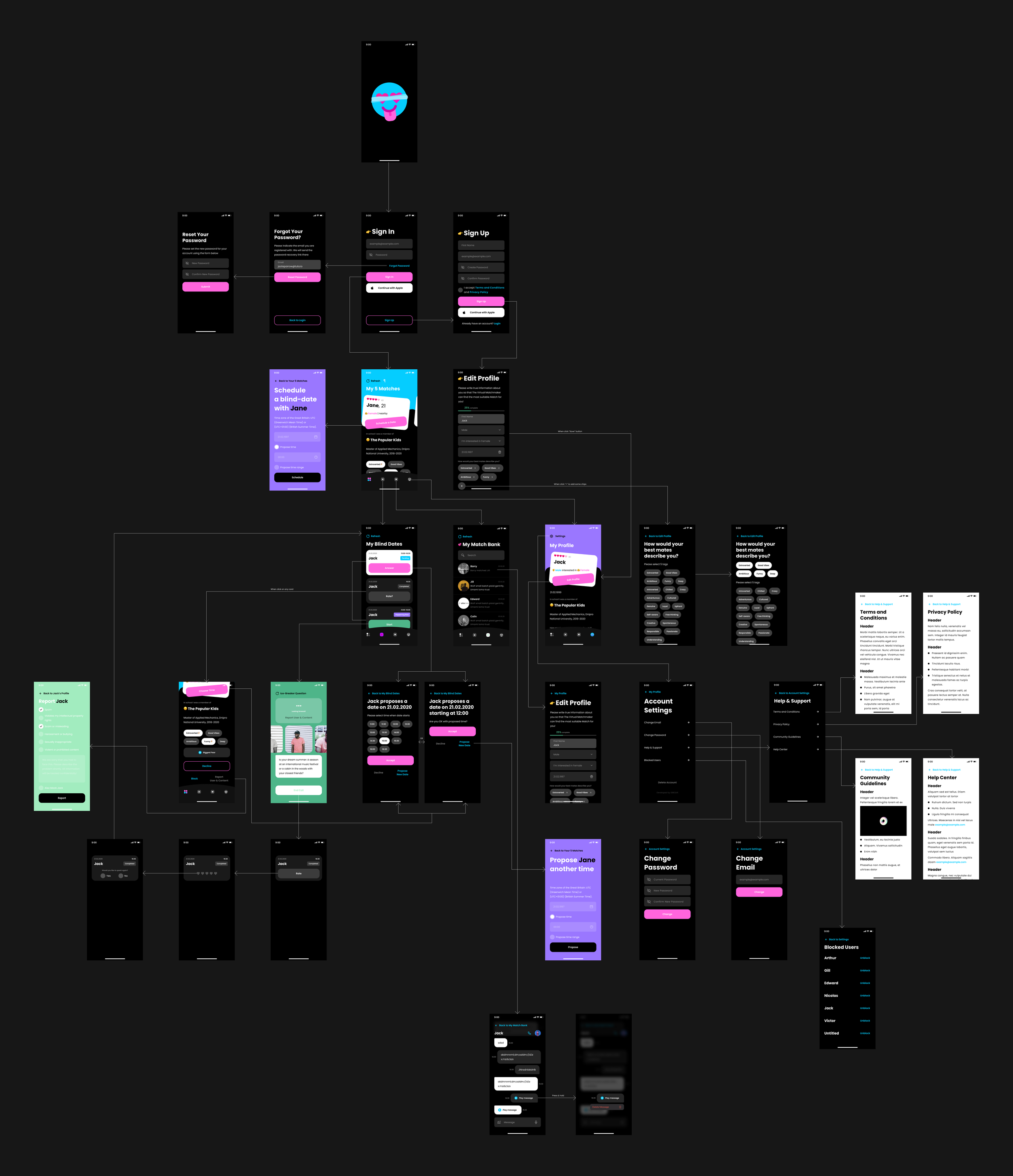
The experience brings profile setup, curated matching, scheduling, voice dates, photo reveals, mutual decisions, and continued communication into one clear journey.
Challenge
The central challenge was turning an unfamiliar dating format into an experience users could understand immediately.
The product had to coordinate several connected scenarios: collecting enough information for meaningful matching, scheduling a date, managing a synchronized live call, revealing photos at the right moment, and enabling further communication only when both people agreed.
At the same time, the experience needed to feel playful and engaging without making important actions, expectations, or safety controls unclear.
Goals
The goal was to create a clear alternative to swipe-based dating while establishing a flexible foundation for future product growth.
The experience needed to:
Make the blind-date concept easy to understand
Guide users through profile setup without unnecessary friction
Build anticipation without creating uncertainty
Keep both participants aligned during a live date
Make consent explicit before opening further communication
Support new features through reusable interface patterns
Product Strategy
The product was structured around one core principle: conversation should come before visual judgment.
Instead of presenting an endless feed of profiles, the experience guides users through a smaller number of meaningful steps. Personal information is revealed progressively, while every stage clearly explains what happens next.
This creates a more intentional journey from initial preferences to a real conversation and, potentially, an ongoing connection.
Profile and preferences
The profile experience captures the information required for relevant matching, including interests, personal characteristics, dating preferences, and location.
Users can also record an audio introduction, giving potential matches a sense of personality before seeing a photo.
Clear grouping, progress feedback, and contextual explanations help make the detailed setup process feel manageable.
Curated matching
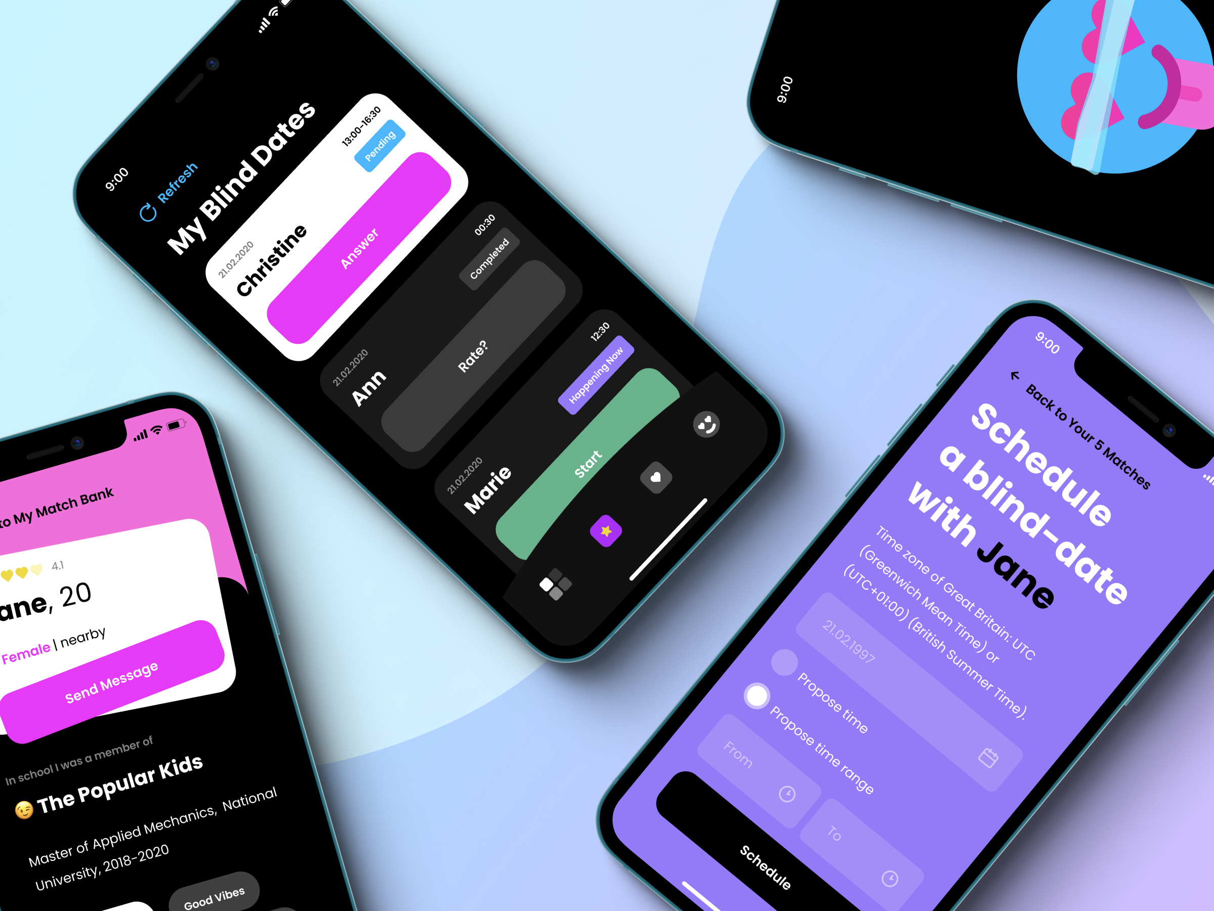
Rather than relying on endless swiping, the product presents a curated selection of relevant matches based on profile information and preferences.
Users can review essential details, skip a suggestion, report or block a profile, and schedule a blind date directly from the matching experience.
This makes discovery feel more considered while keeping the next action clear.
The blind-date experience
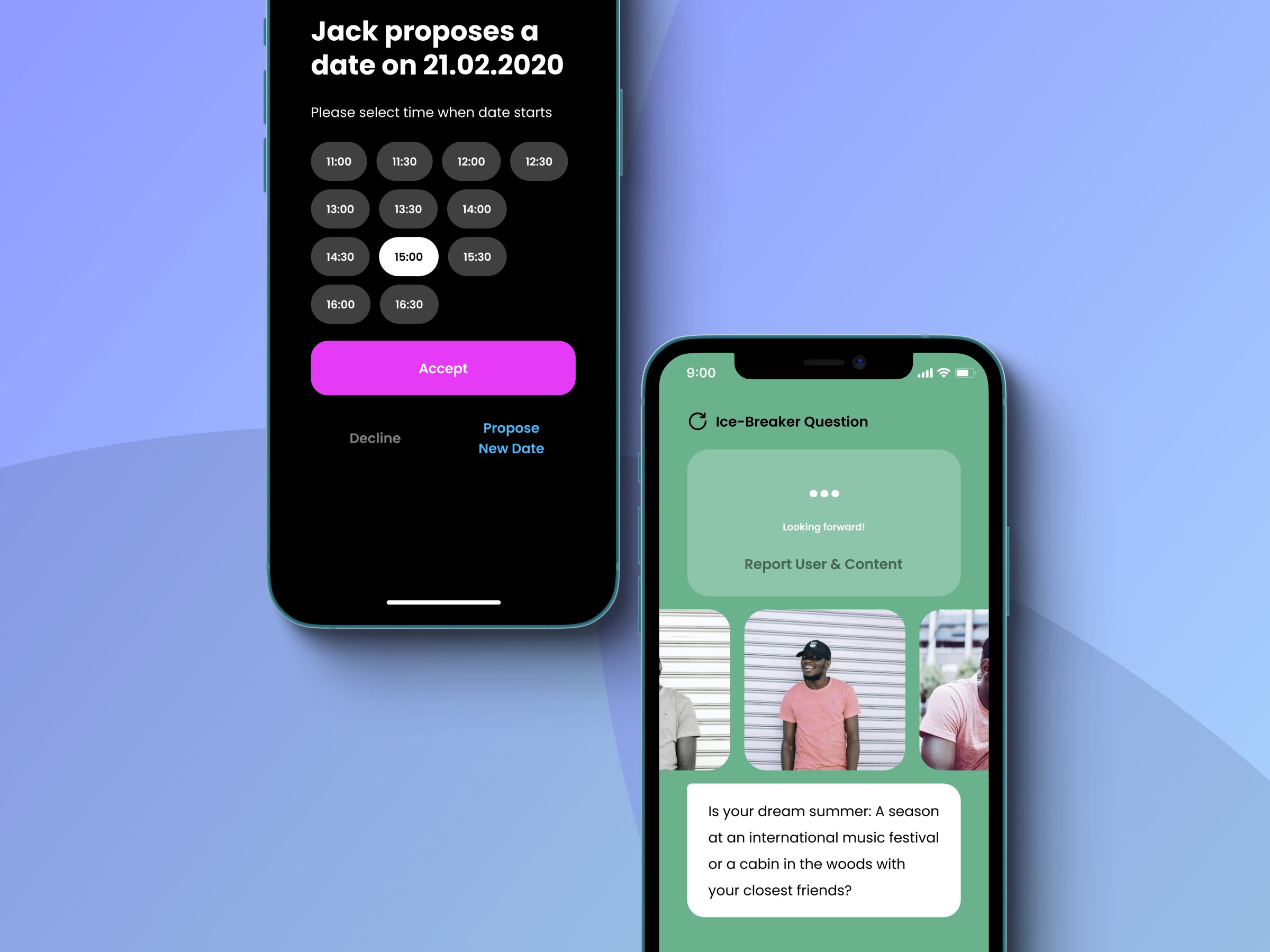
The core interaction is a scheduled five-minute audio date.
During the call, both participants see the same countdown and can use suggested icebreaker questions when needed. Photos remain hidden until the conversation ends, helping users focus on personality and communication first.
At the end of the timer, both profiles are revealed and each participant can decide whether they would like to continue the connection.
Mutual connections
Further communication becomes available only when both people express interest.
When the decision is mutual, the connection moves into a dedicated match area where users can continue through private messaging. This keeps consent visible and prevents unwanted conversations from appearing automatically.
The transition from date to match is designed to feel simple, positive, and easy to understand.
Voice guidance
A contextual voice companion supports users throughout the experience.
It provides guidance during profile setup, suggests conversation starters, and helps users prepare for a date. The feature adds personality to the product while making unfamiliar interactions feel more approachable.
Visual language
The interface uses a bold, retro-inspired visual direction while keeping the underlying interaction model simple.
Different color environments help users recognize the current context: lighter screens support content-heavy tasks, green identifies live calls, and violet highlights scheduling and time-based actions.
The visual system avoids unnecessary effects, relying instead on typography, contrast, color, and clear interface states.
Design system
Reusable foundations were created for profiles, match cards, scheduling, call states, forms, messaging, feedback, and navigation.
Shared components and interaction patterns keep the experience consistent across connected user journeys while making it easier to introduce new screens and functionality as the product evolves.
Outcome
The final concept transformed an unconventional dating idea into a coherent, development-ready mobile experience.
Users move through a clear journey from profile creation and curated matching to a timed voice date, photo reveal, mutual decision, and continued communication.
The modular interface foundation gives the product room to evolve without losing clarity or consistency.
