Building a scalable Flutter Design System for enterprise products
Designed a comprehensive Flutter design system based on an existing enterprise foundation and Material Design 3, enabling consistent, scalable UI development across future mobile applications.
Challenge
An enterprise client needed a dedicated design system for future Flutter applications. While an existing design language was already in place, it wasn't optimized for Flutter development or aligned with the latest Material Design 3 principles. The goal was to create a scalable foundation that developers and designers could consistently build upon across multiple products.
Goals
Create a Flutter-first design system that extends the existing enterprise design language while fully embracing Material Design 3. Ensure consistency, improve development efficiency, and provide a reusable component library capable of supporting future products.
Research & Strategy
The project began with an in-depth analysis of Material Design 3, including its design tokens, adaptive color system, component behaviors, elevation model, typography, spacing, and interaction patterns.
We audited the existing enterprise design system to identify reusable foundations and areas requiring adaptation for Flutter. The resulting architecture balanced Material standards with product-specific requirements, creating a flexible system that could evolve alongside future applications.
Solution
A dedicated Flutter design system was created from the ground up, combining enterprise UI standards with Material Design 3 best practices. Rather than simply replicating Material components, the system extended them to support the client's product ecosystem while maintaining consistency, accessibility, and implementation efficiency.
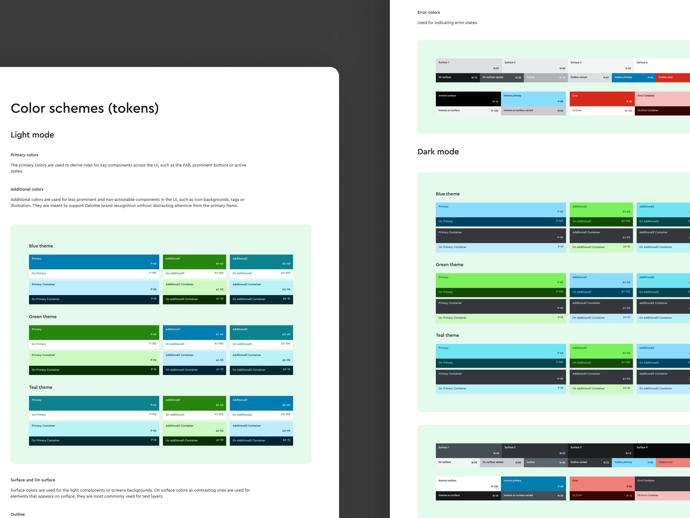
The library included reusable components, design tokens, adaptive color schemes, typography, spacing, iconography, elevation rules, and interaction states, all documented for seamless collaboration between design and engineering teams.
-
A scalable token-based architecture established consistent foundations for color, typography, spacing, corner radius, elevation, and motion, making the system easy to maintain and extend.
-
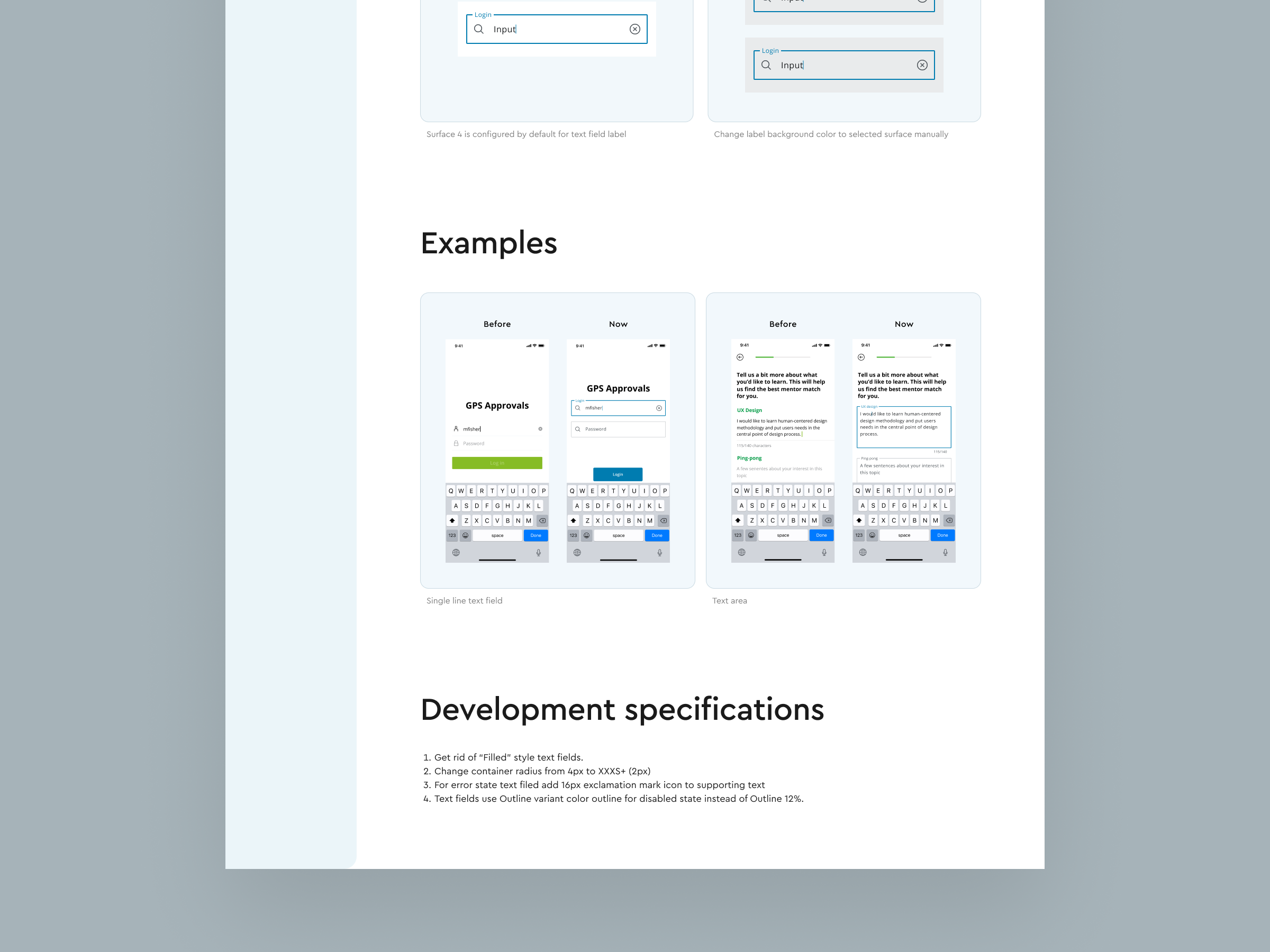
Every component was carefully adapted to follow Material Design 3 guidelines while preserving the enterprise visual language. This ensured familiarity for users and implementation consistency for developers.
-
Built a reusable collection of production-ready Flutter components including buttons, inputs, navigation patterns, cards, dialogs, lists, menus, chips, switches, selection controls, feedback components, and layout primitives.
-
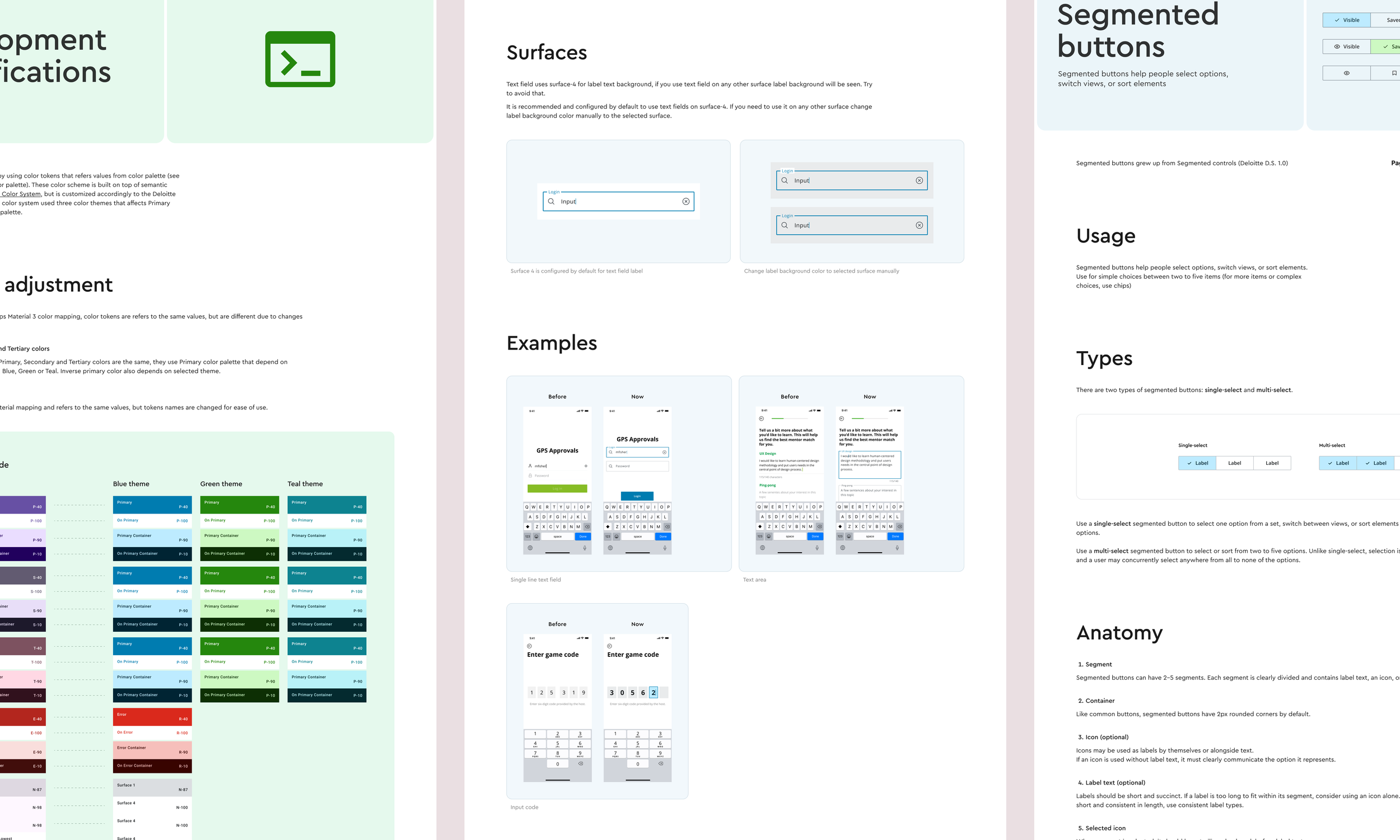
The design system included comprehensive documentation covering component usage, variants, interaction states, accessibility considerations, and implementation guidance to improve collaboration across multidisciplinary teams.
Outcome
The resulting design system established a scalable UI foundation for future Flutter products, improving consistency across interfaces, accelerating design and development workflows, and reducing the effort required to launch new applications.
