Why enterprise products still need design concepts
Design exploration within one of the industry's strictest design systems
Design concepts are often associated with marketing websites or consumer applications. Enterprise software rarely gets the same treatment. Tight design systems, established component libraries, accessibility requirements, and years of accumulated brand guidelines usually leave little room for experimentation.
This project challenged that assumption.
The task was to create several visual concepts for an internal text-based learning platform designed to make complex educational content more engaging through gamification. Instead of reading static documentation, employees progressed through interactive scenarios where every decision became part of the learning experience.
The product wasn't intended to redefine the company's visual identity. It was designed to prove that engagement can increase even when every interface must follow strict enterprise standards.
The challenge
The existing design system already defined nearly every aspect of the interface.
Typography followed approved scales. Colors were limited to predefined brand tokens. Components had standardized behavior. Grid, spacing, accessibility, iconography, and interaction patterns were documented across hundreds of pages of internal guidelines.
From a visual perspective, almost every design decision had already been made years before.
The question became surprisingly simple.
–“Can five completely different experiences exist while using exactly the same design system?”
Design principles
Rather than designing five interfaces, the exploration focused on five different emotional experiences.
Every concept followed the same principles.
The component library remained unchanged.
Accessibility requirements were preserved.
Brand colors were never replaced.
Typography followed the existing scale.
Layout rules respected the design system.
Every screen remained implementation-ready.
Instead of changing the foundations, the concepts explored composition, illustration, atmosphere, rhythm, hierarchy, visual storytelling, and motion language.
The interface behaved the same.
The experience felt completely different.
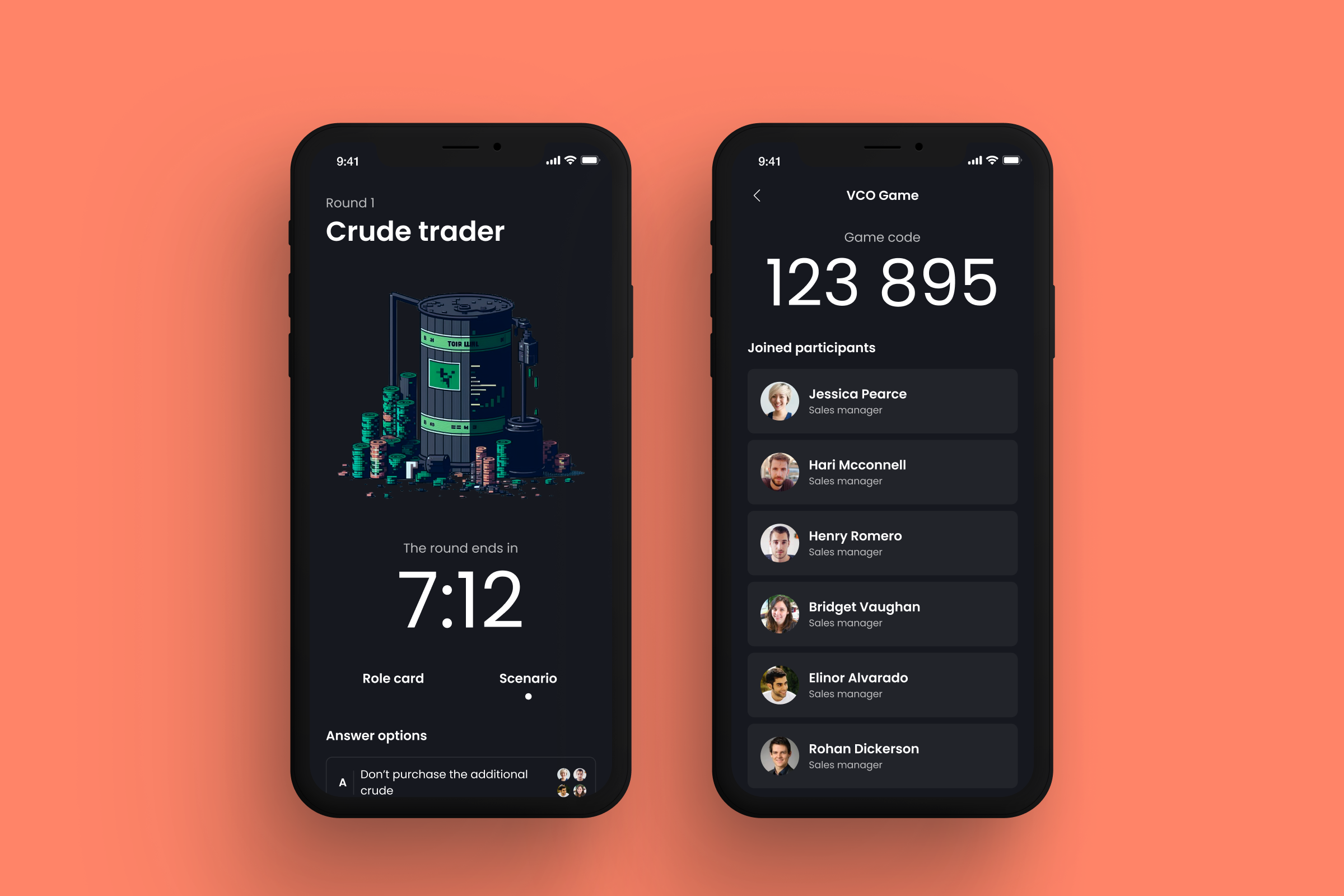
Concept 1: Retro
Retro transformed the learning journey into something resembling classic adventure games and early computer interfaces.
Large typography, pixel-inspired graphics, subtle texture, and nostalgic visual references created a playful atmosphere while preserving enterprise-level readability and accessibility.
The objective wasn't nostalgia itself.
It was reducing the psychological distance between users and mandatory training by making the experience feel approachable.
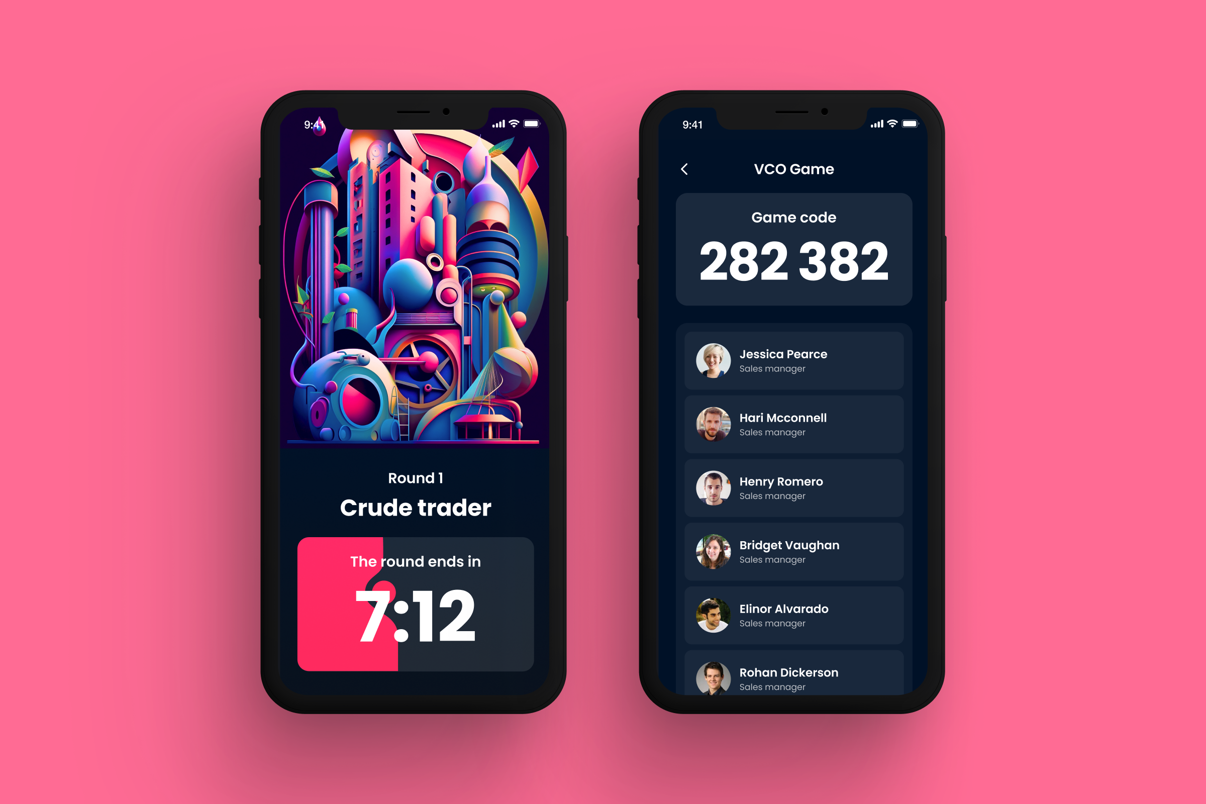
Concept 2: Futuristic
The Futuristic direction explored a cleaner and more technological visual language.
Structured compositions, geometric accents, layered surfaces, and subtle depth introduced a stronger sense of innovation without adding unnecessary complexity.
Rather than relying on flashy effects, the concept focused on precision and clarity.
Everything felt more advanced while remaining instantly familiar.
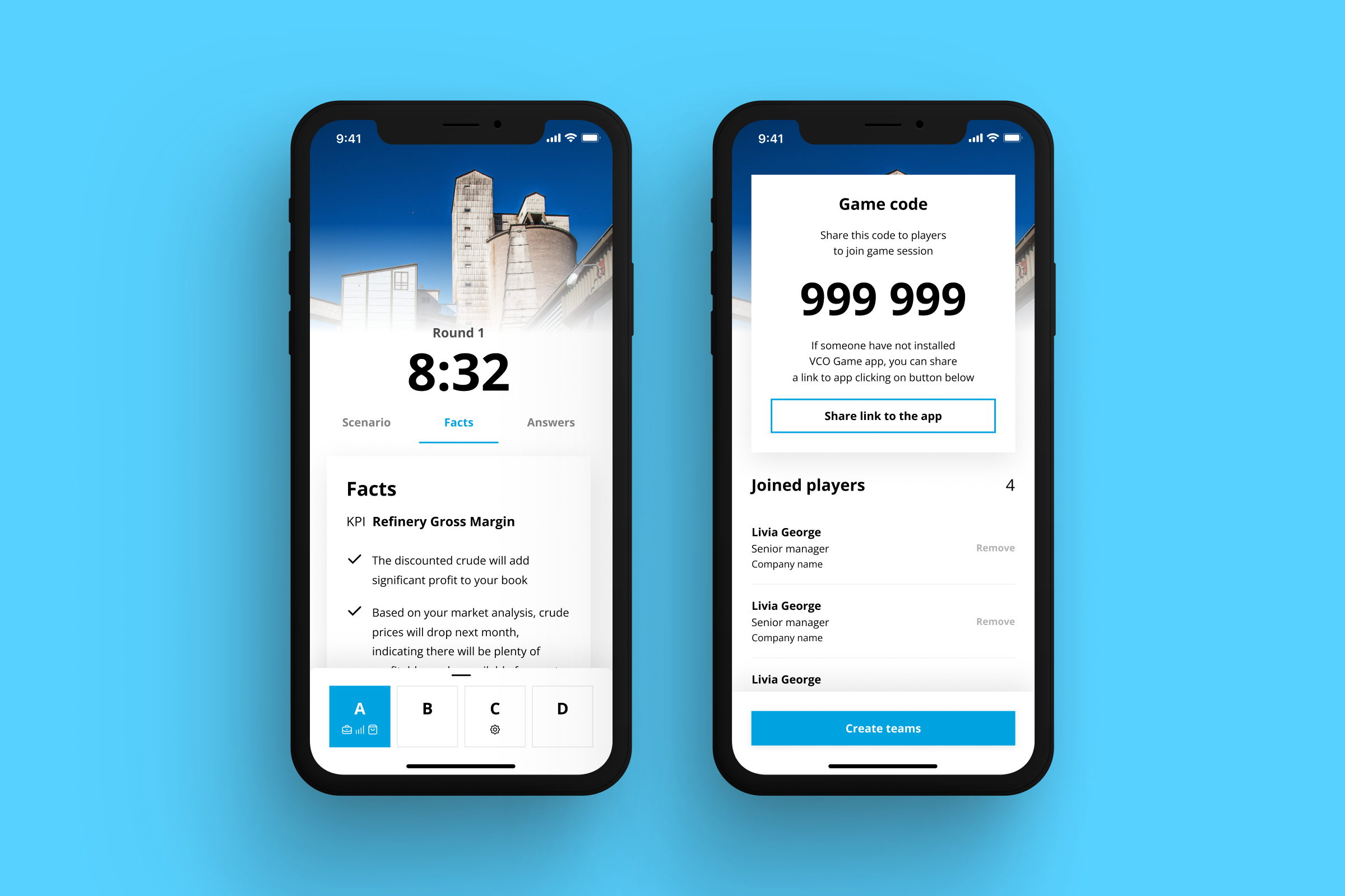
Concept 3: Minimal
Minimalism proved that removing elements often creates a stronger experience than adding them.
Whitespace became an active design tool.
Typography became the primary interface.
Visual hierarchy replaced decoration.
For educational products, this approach significantly reduced cognitive load and allowed users to focus entirely on the learning process instead of the interface itself.
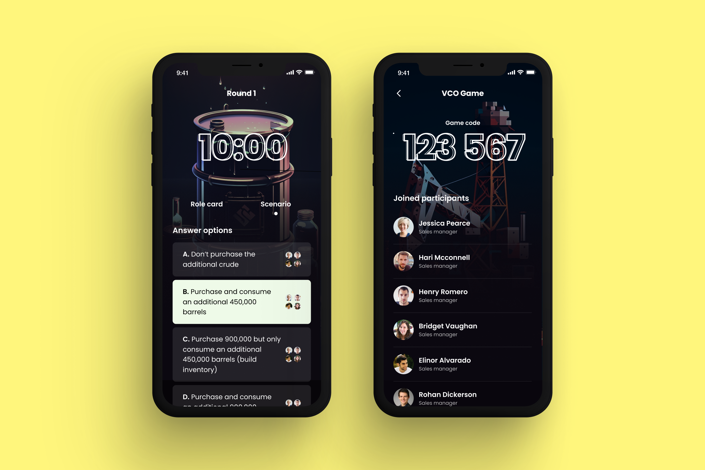
Concept 4: Cosmic
Cosmic introduced atmosphere without compromising usability.
Inspired by exploration and discovery, the interface used dark environments, gradients, abstract lighting, and space-inspired compositions to reinforce the feeling of progressing through unknown territory.
Learning became a journey rather than a sequence of screens.
Importantly, none of these effects required changes to the underlying component system.
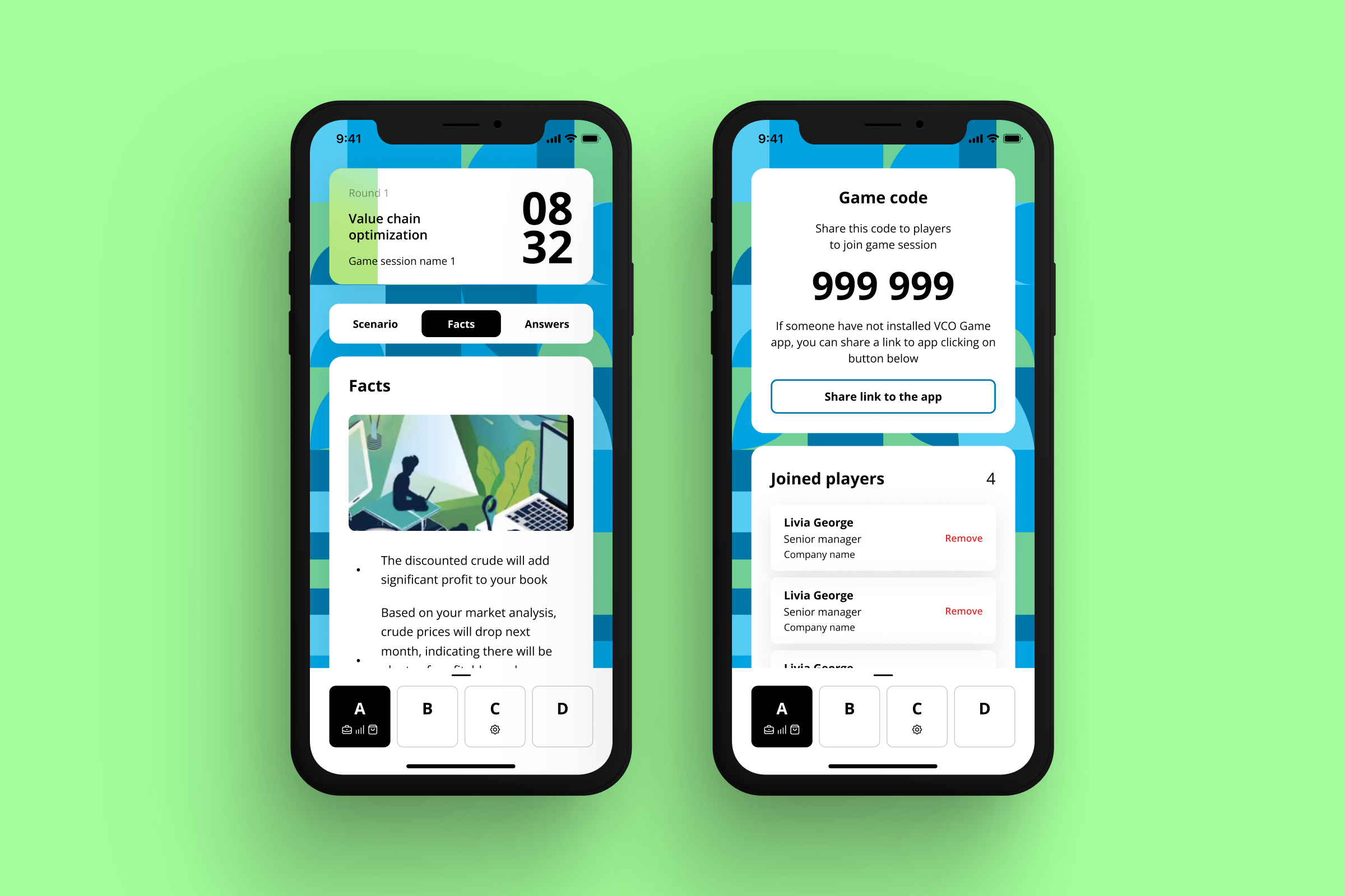
Concept 5: Colorful
Enterprise software often becomes visually conservative over time.
This concept explored the opposite.
Using only approved brand colors, the interface adopted higher contrast, bolder compositions, expressive illustrations, and more energetic layouts.
The result demonstrated that personality doesn't require additional colors.
Sometimes it simply requires using existing ones more intentionally.
What actually changed?
Interestingly, almost nothing.
Buttons remained identical.
Input fields remained identical.
Cards, typography, spacing, accessibility, and components all came directly from the existing design system.
The only variables were composition, illustration style, visual rhythm, information density, hierarchy, imagery, and emotional tone.
Yet every concept felt like a completely different product.
This illustrates an important principle of modern product design:
A design system defines consistency.
It should never define personality.
Why concept exploration matters
Design concepts are frequently misunderstood as visual exercises created to impress stakeholders.
In reality, they reduce risk.
Exploring multiple directions early allows teams to validate emotional responses before engineering begins. It creates alignment between designers, product owners, and leadership while exposing opportunities that would never emerge from incremental iteration.
For enterprise organizations, concept exploration is particularly valuable because implementation costs are significantly higher than in smaller products.
Finding the right direction before development saves months of refinement later.
Key takeaways
This project demonstrated that creativity does not disappear inside mature design systems.
In many ways, it becomes more valuable.
Working within constraints forces designers to think beyond colors and components. It shifts attention toward hierarchy, storytelling, pacing, interaction, atmosphere, and user psychology.
The strongest design systems are not those that eliminate creative freedom.
They are the ones that provide enough consistency for creativity to evolve safely at scale.
Services
-
Creating multiple visual directions to validate product personality before implementation.
-
Designing scalable interfaces that respect mature design systems while improving usability and engagement.
-
Extending existing component libraries without compromising consistency, accessibility, or development efficiency.
-
Transforming educational and operational workflows into engaging, interactive digital products through narrative, progression, and thoughtful UX.
