
A website redesign for a software development company. Working with the E-Soft team, we structured three service areas and created a shared system of copy, interface design, and illustrations to support the company’s efforts to attract external clients.
Industry Software development · B2B
Services Website design · Design systems
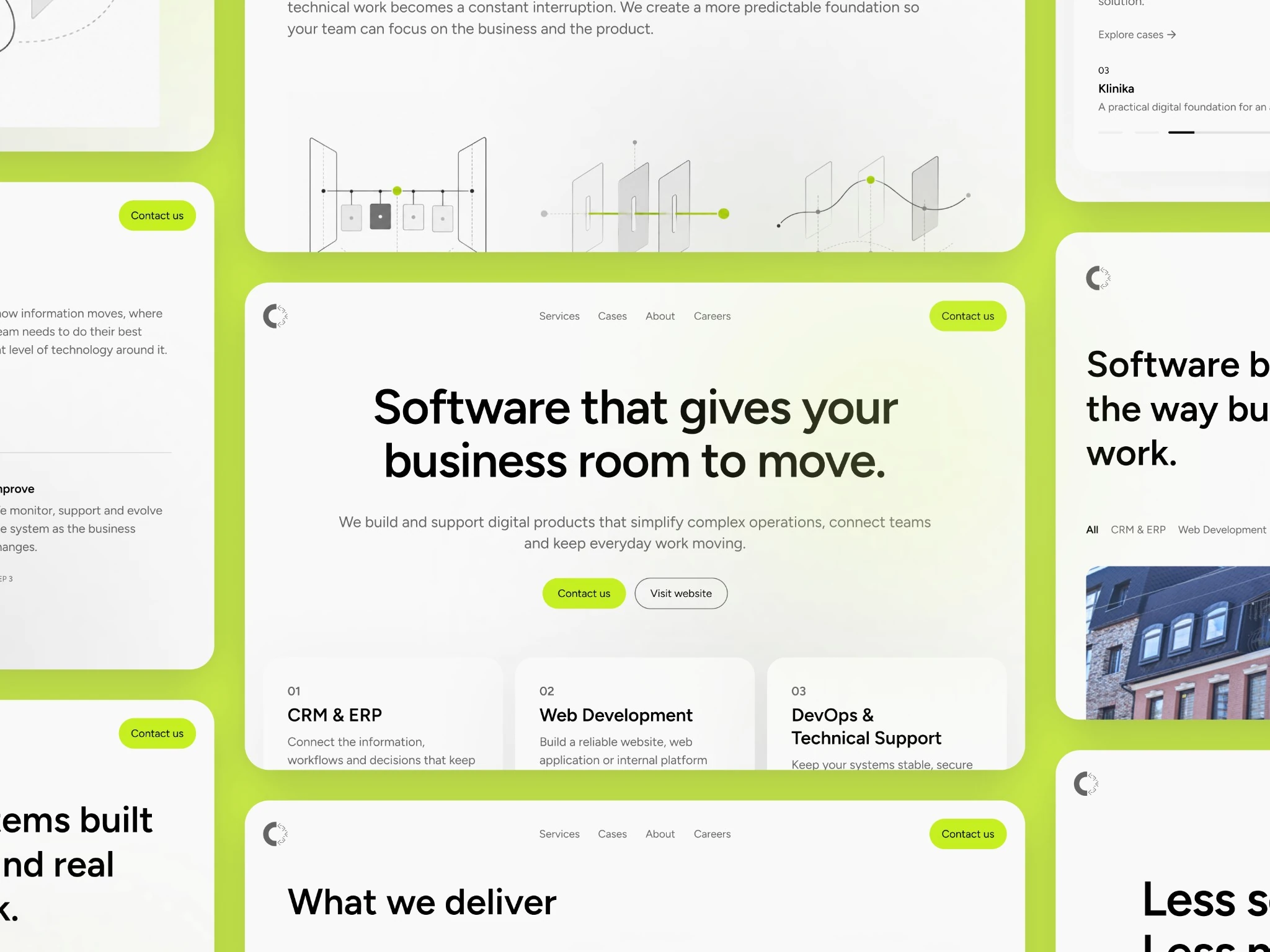
We helped E-Soft explain its expertise through the business problems it solves. Working with the E-Soft team, we defined the website’s commercial focus and carried it through the service structure, copy, and visual system. The resulting design helps prospective clients understand what the company offers and start a conversation about their project.
01
The E-Soft team came to us with a clear brief: update the website to attract external clients and support future advertising. The team explained that the previous website had been built around five years earlier as a company brochure and was no longer helping sell the company’s services.
E-Soft works with business systems, web products, and technical infrastructure. The new website needed to explain the problem each service solves and help prospective clients recognise when to approach the team.
02
The E-Soft team outlined the priorities: a technology-focused identity, large, restrained typography, concise copy, and lime as an accent colour. We translated these requirements into specific decisions: introduce the services on the homepage, explain each on a dedicated page, and build the graphics around connections, layers, and data flows.
We started with the existing brief and company materials. The scope covered the homepage, three service pages, Cases, About, Careers, and Contact. Our work focused on the website design and how it presents E-Soft’s business.
Clearl’s role. Website structure, copy, UI design, a design system, and custom illustrations. The E-Soft team provided the commercial context and requirements for how the company should be presented.
03
The homepage introduces E-Soft’s three service areas alongside the company’s overall offer. Visitors get an overview and can choose the area that matches their needs. The service pages explain the work in more detail and provide a next step for getting in touch.
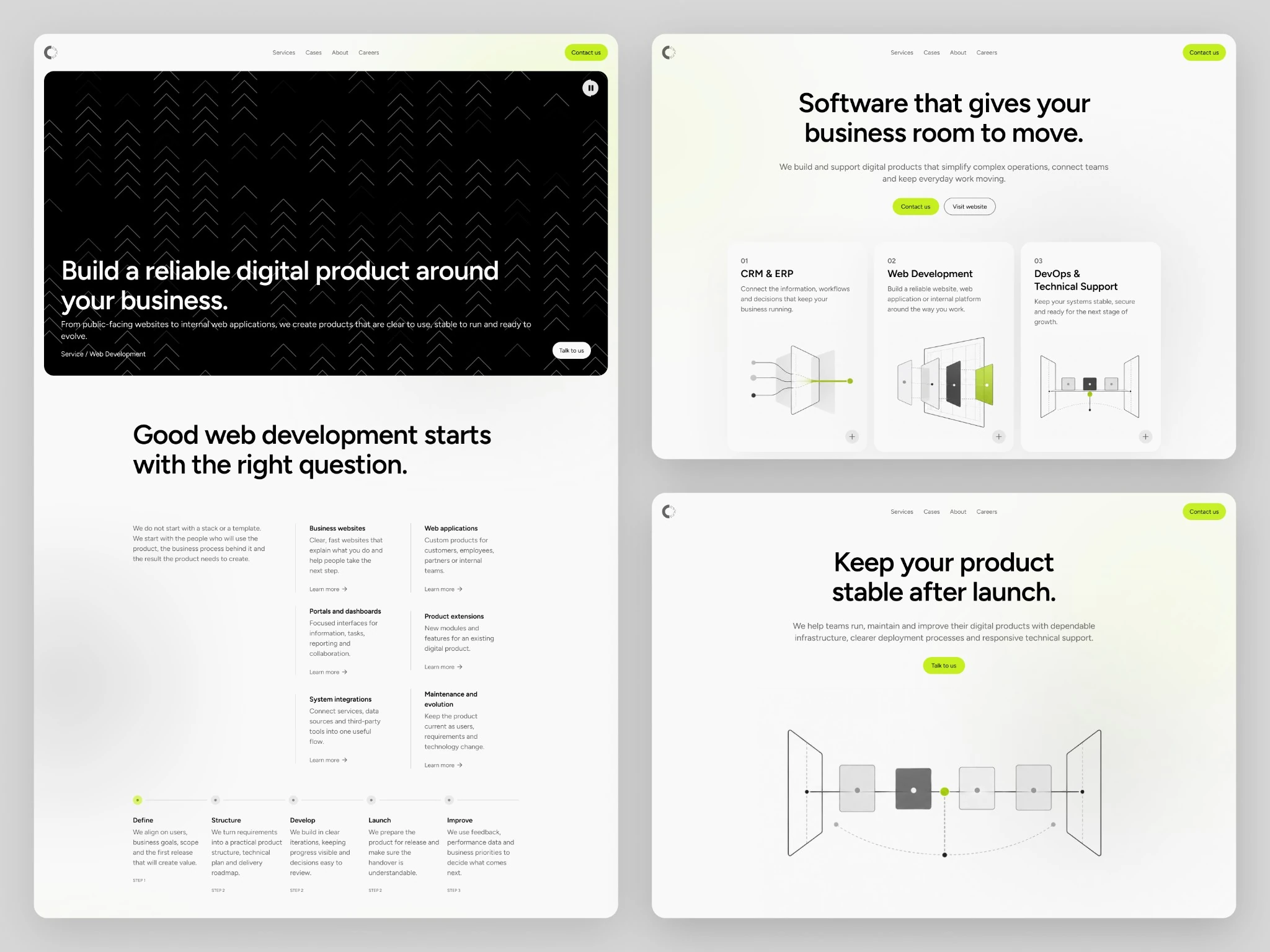
For example, Web Development is explained through business websites, web applications, portals and dashboards, integrations, product extensions, and maintenance. The process section shows E-Soft’s approach from defining the task to launch and ongoing improvements.
04
The visual language combines large typography, light surfaces, graphite, and fine geometric lines. Lime highlights primary actions and key points within the illustrations. A contrasting dark hero gives the service pages a stronger visual presence.
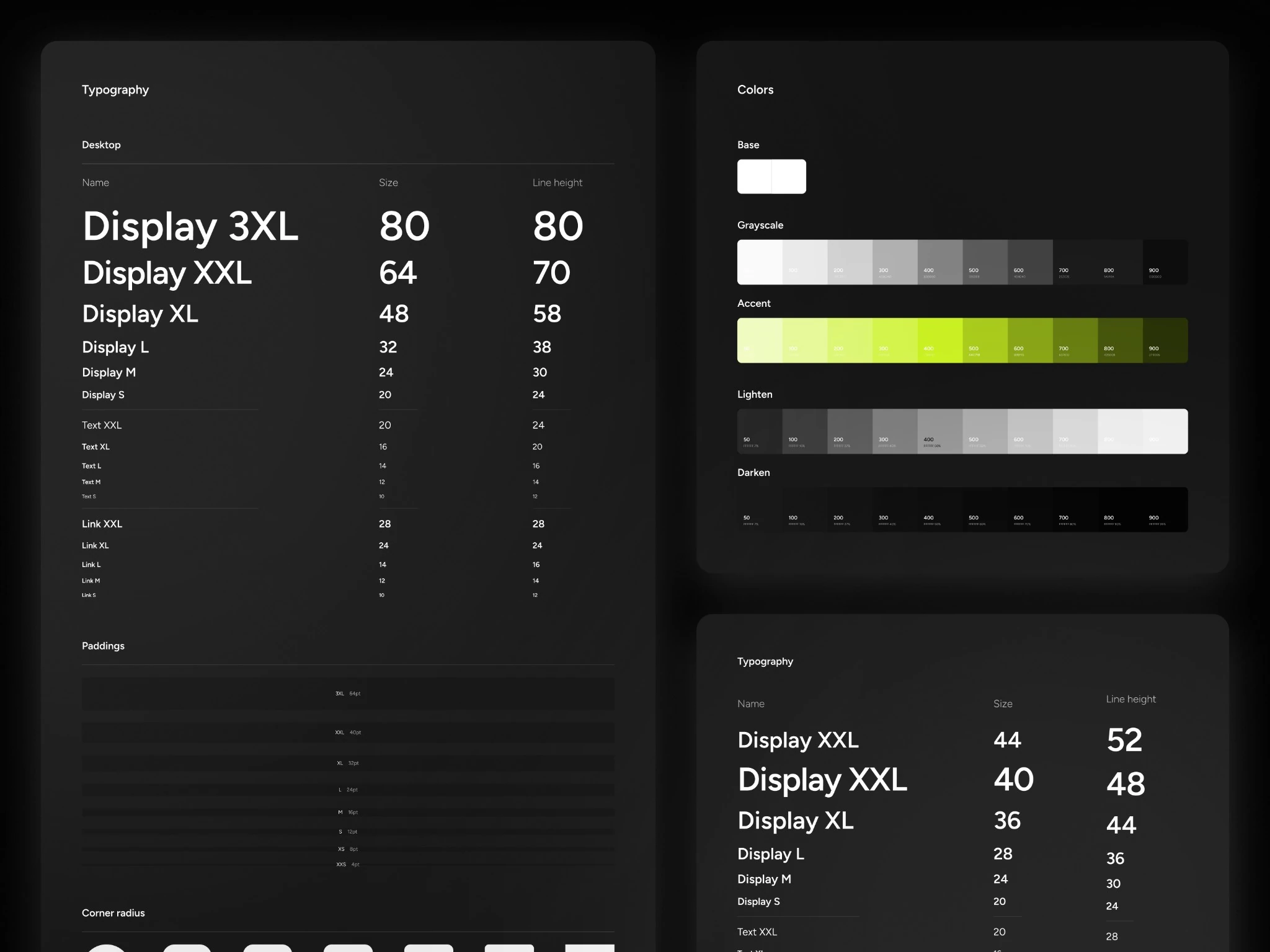
Custom graphics support the content: connected flows for CRM & ERP, product layers for Web Development, and linked infrastructure elements for DevOps. We also defined typography scales, the colour palette, spacing, and component corner radii to support reuse.
05
We delivered a website design that explains E-Soft’s offer consistently, from the overall positioning on the homepage to specific business needs on the service pages. Each of the three service areas has a dedicated place in the structure and follows the same presentation logic.
Alongside the page designs, we created a foundation for further work: copy, reusable components, design rules, and a consistent illustration style. New pages can build on the same foundation while keeping the website recognisable.
The design supports E-Soft’s next goal: attracting external clients and launching advertising. The page content takes visitors from getting to know the company to choosing a service and discussing their needs.